
Research
Meenta helps genome researchers find sequersers for research. They do it by allowing scientists to rent time on squencers around the world on institutions that otherwise would have those squencers not running. There are two sides to this enterprise, on one are the scientists that need to find the squencers and on the other the sequencer holders that would put their devices on Meenta’s web app. I will be focusing on the design and communication for the sequence holder.
The discovery
I audited the existing experience, reviewed competitors and reached out to the CTO of Meenta, our partner, to get data on from their current users.
The heuristic markup of the Meenta web app revealed a confusing location of the sign-in button to the dashboard, two different messengers, and a lack of unified visual identity. The sign-in button was located halfway through the hero of the main webpage. This made easily scanning the site to sign-in unintuitive. There were two messengers, one embedded in the web app and another one that could be accessed from a button in the same messenger and opened on a full page. The notifications or messages from Meenta were not clearly differentiated on it which made it hard to scan. The full page messenger had a different look and feel from the one embedded in the app, they felt as if they were two separate platforms and not an extension of the first.
The competitor analysis showed how to clearly distinguish between notifications from the platform and messages from inside a chat. The navigation and possibility of expanding the chat window always kept a clear and concise visual identity and made it feel like an extension and not a new app.
Understanding the user
The Meenta’s CTO has a wealth of knowledge from their users. Most of the scientists were really hard to get for an interview and only a few questions were answered from our survey. So we moved on to understand what were the biggest pain points for our users. We found that they were flooded with emails from meenta’s platform and scientists, and that made it very cumbersome to navigate and time consuming. So the users needed a way to centralize both communications so they could effectively manage their samples and squencers.
Design
The design is divided in two stages to tackle the needs the research helped discover. First design an intuitive and useful communication tool for the sequencer holder, and second design a style guide to provide a coherent look and feel for the web app.
Ideating and discovering
During the first ideation discoveries it became clear that the sequencer holder needed more data while interacting within the messenger. While designing first ideas, interaction between Meenta, the researcher and the sequencer holder was based on the state of the sample. That meant that the potential exchange within the app that could replace the endless threads of emails was mostly based on the state of the sample. This led to amplifying the scope of the design to include more information to the messenger window.
Wireframing and validating
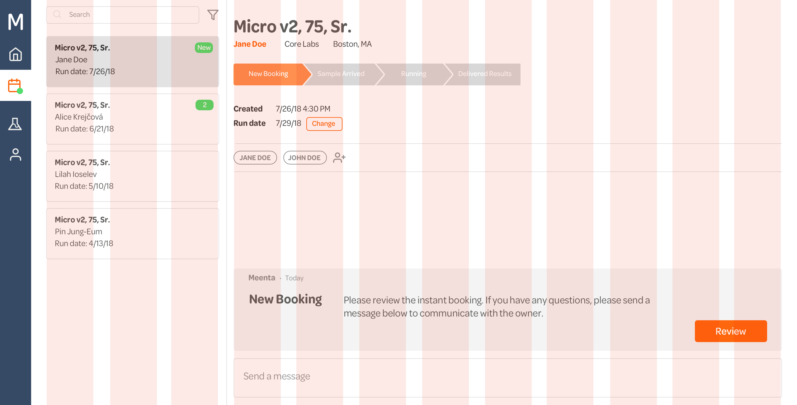
Validation on this project was a challenge considering that Meenta customers, specially the sequencer holders were hard to access, as they are very busy users and the time frame to deliver the project was coming to a close. To resolve this, my fellow classmates and Meenta’s CTO helped validating and guiding this process. I validated two possible solutions, one was based on the process of getting the sample run by the sequencer holders from beginning to end and the communication that could happen within that step. For some of the validators the solution was not completely clear and the way of chatting and reviewing past chats was not completely clear. The second solution presented the majority of the sample and researcher information on top with a space below for a chat and clearly defined notifications from Meenta. From the Validation, this was the most intuitive and useful solution of the two.
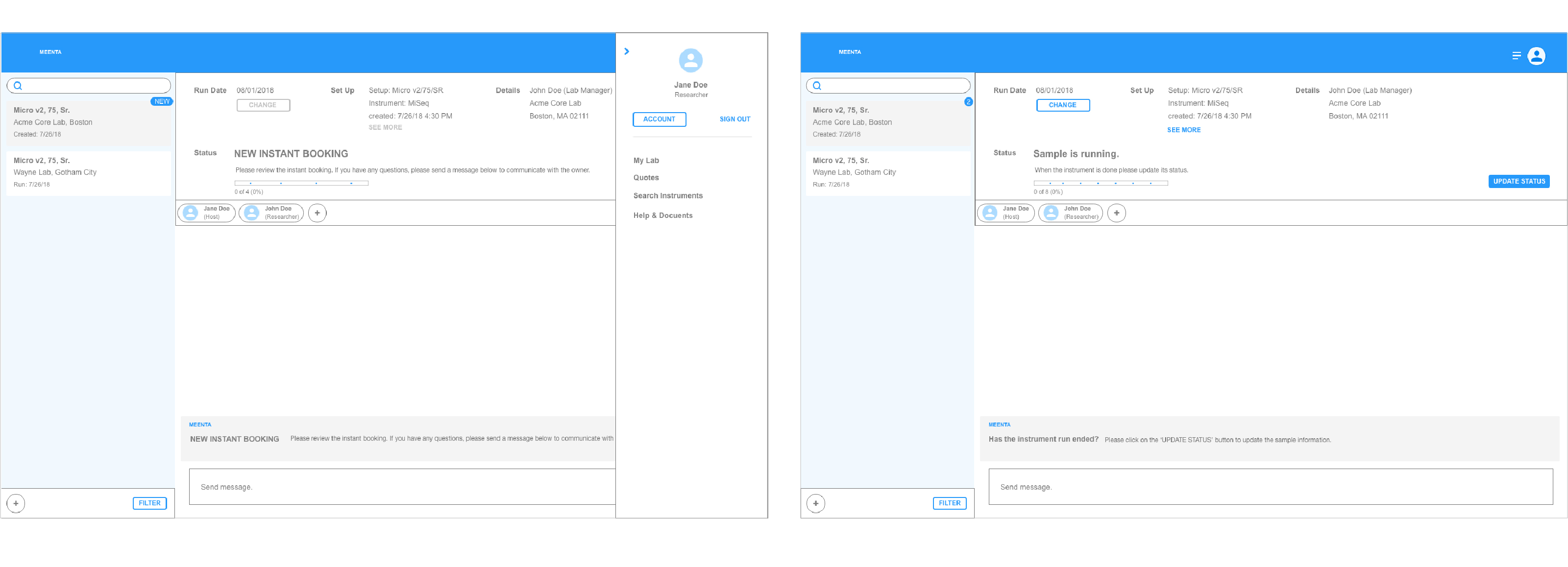
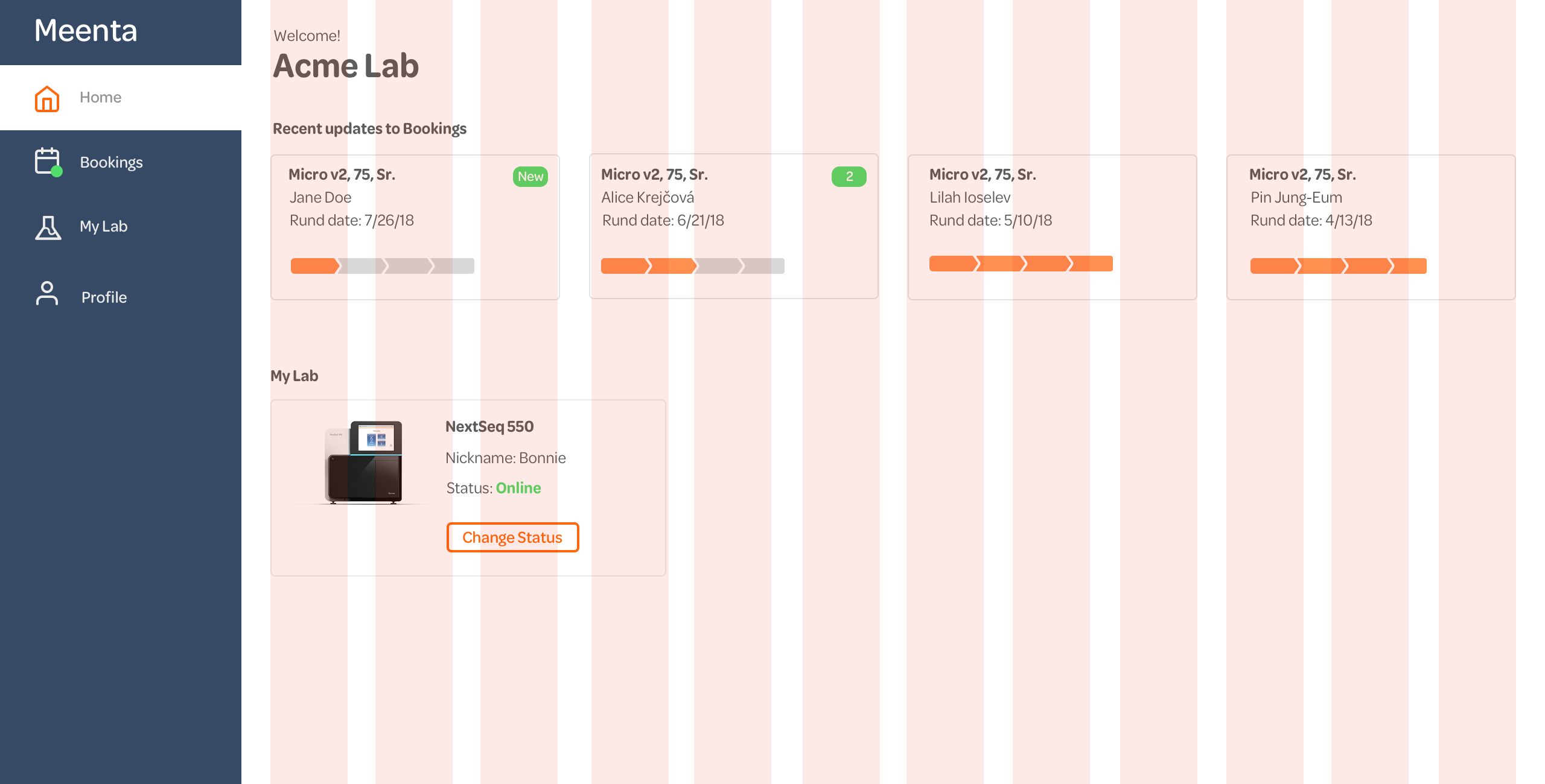
A home for the sequencers
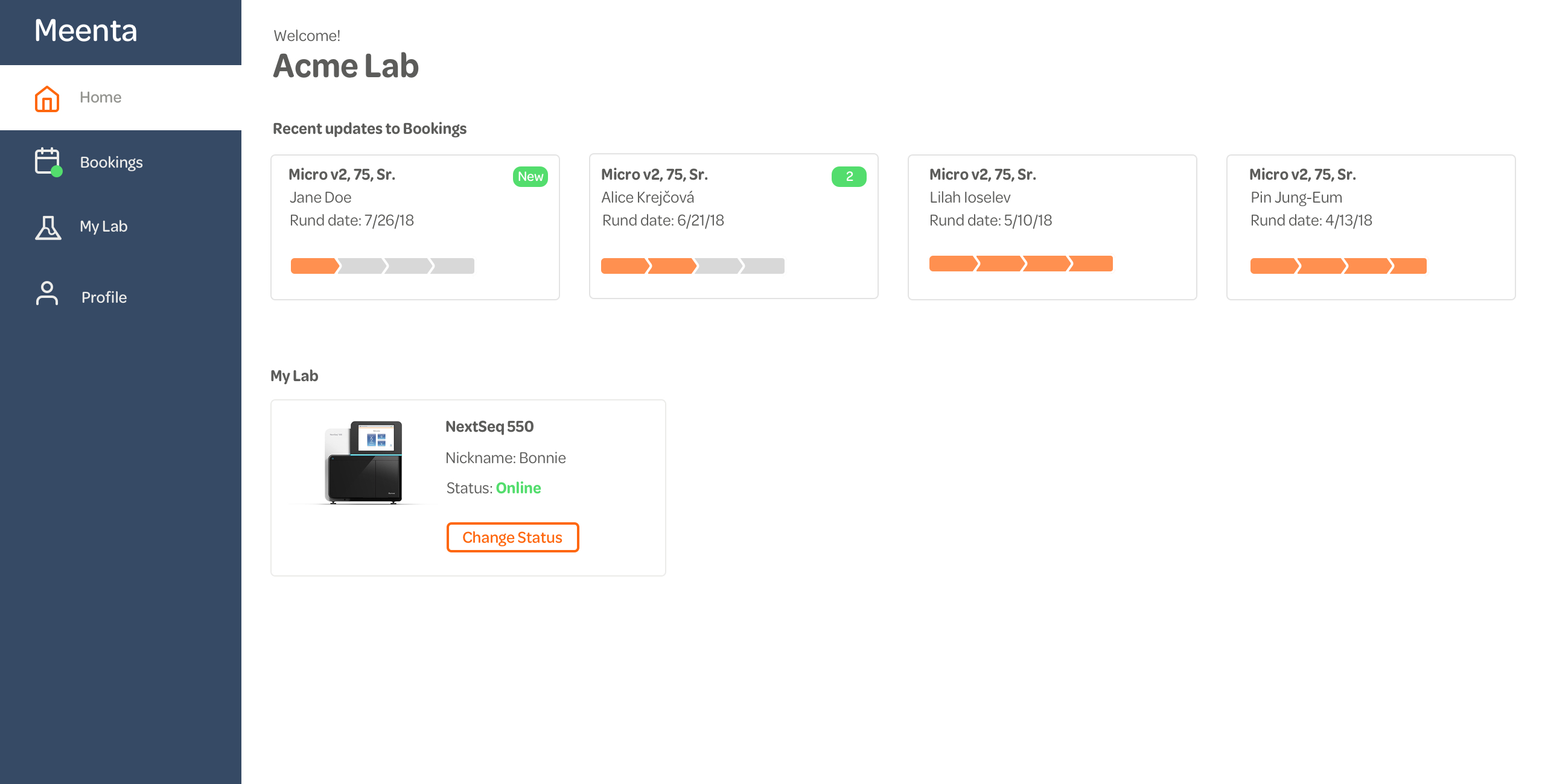
The validation also revealed that a home in the webapp was missing. This home should allow the user a quick glance of the most recent sample updates and their sequencers online in Meenta.
The design system
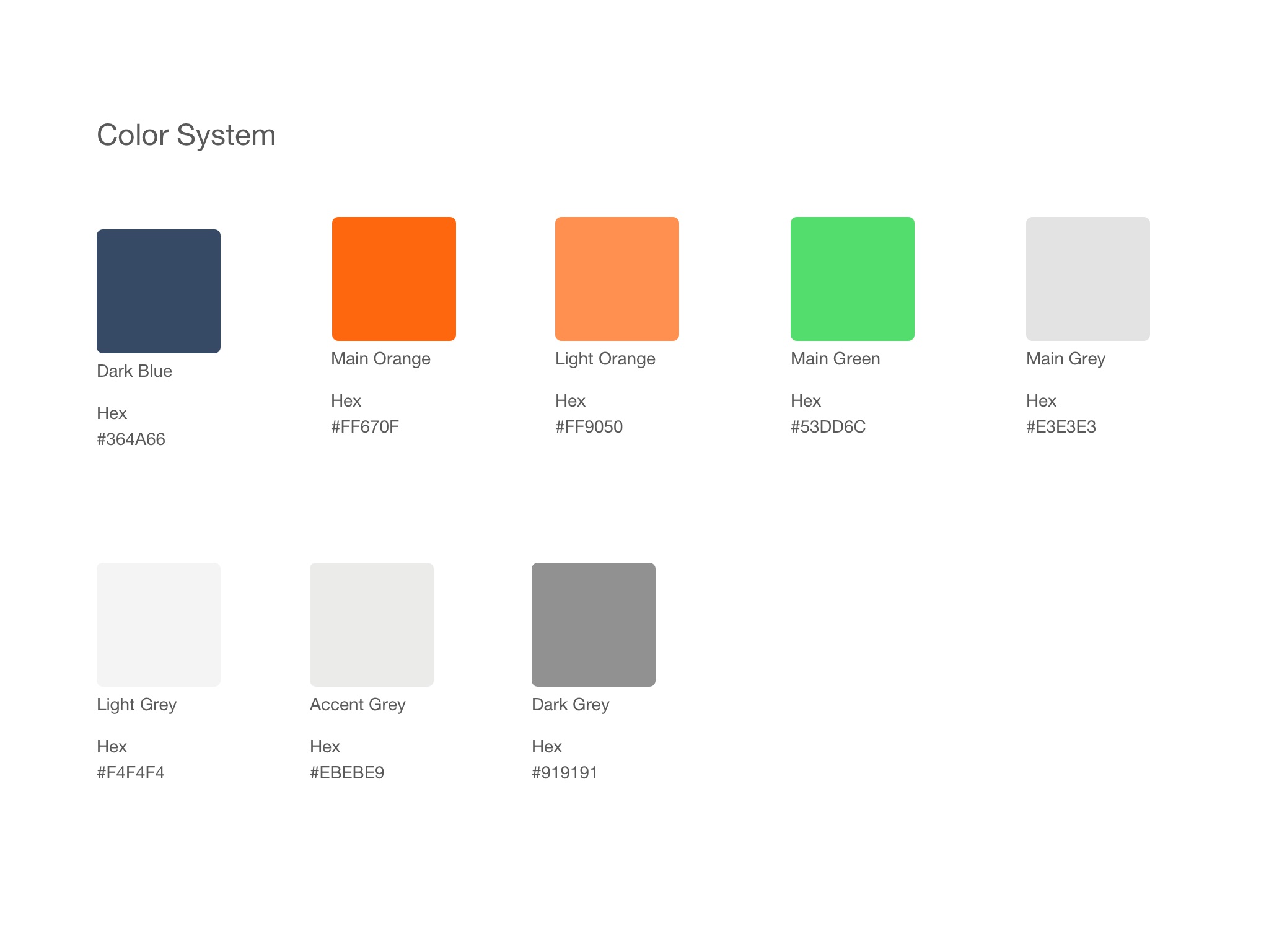
The inspiration for the color scheme and typography started from an interview with the co-founders of Meenta. In it, we asked for words that would define the Meenta brand. Easy was their favorite word to define Meenta, I created a mood board that took some of the blues they were currently using on their brand and changed their hues dramatically to produce a sense of easiness and airiness.
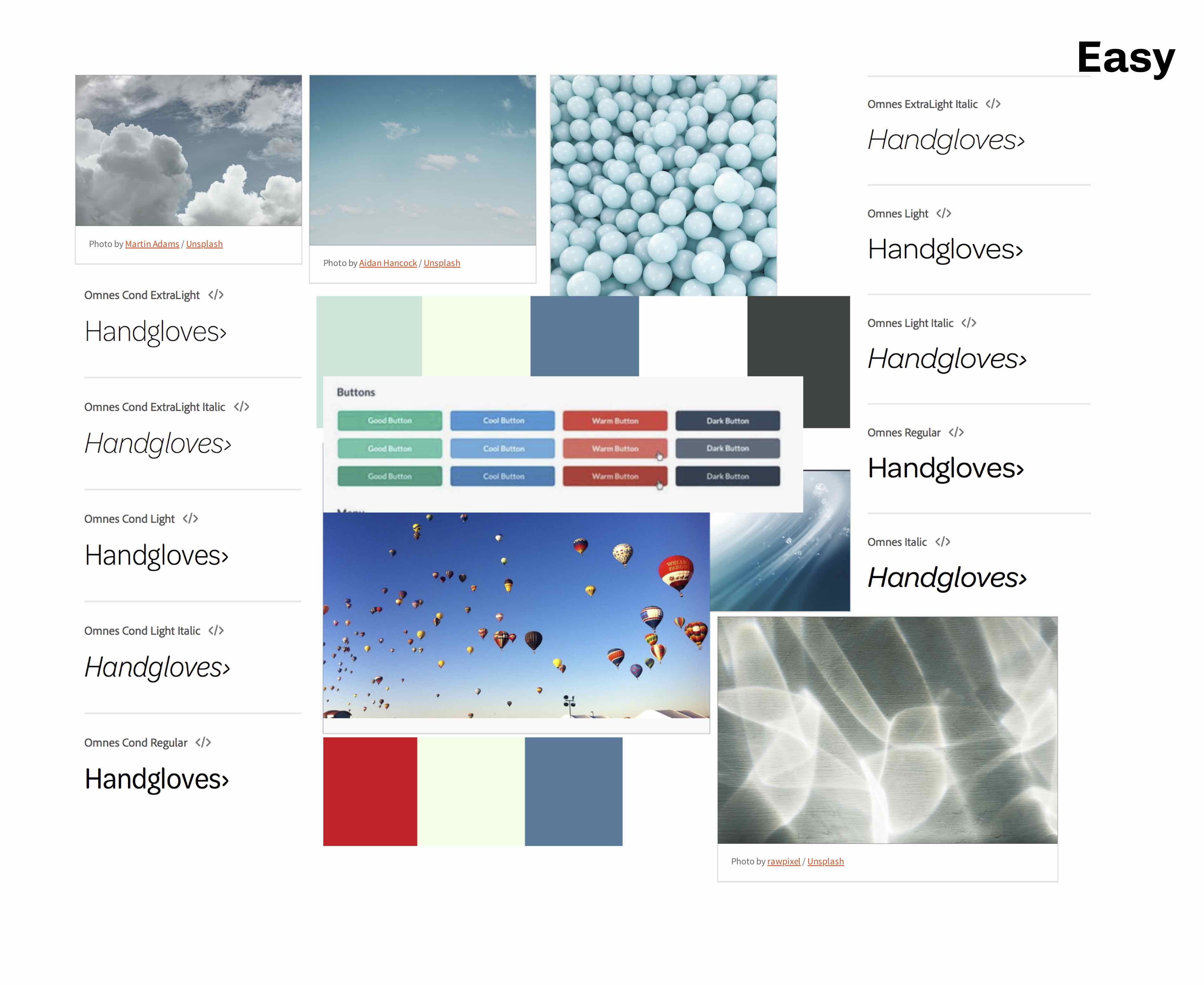
Although this project was focused on a desktop web app, I decided to create a design system that could scale up easily. A clear and unified typography system, icons, buttons, and cards make this design system a robust starting point for a rapid deployment.
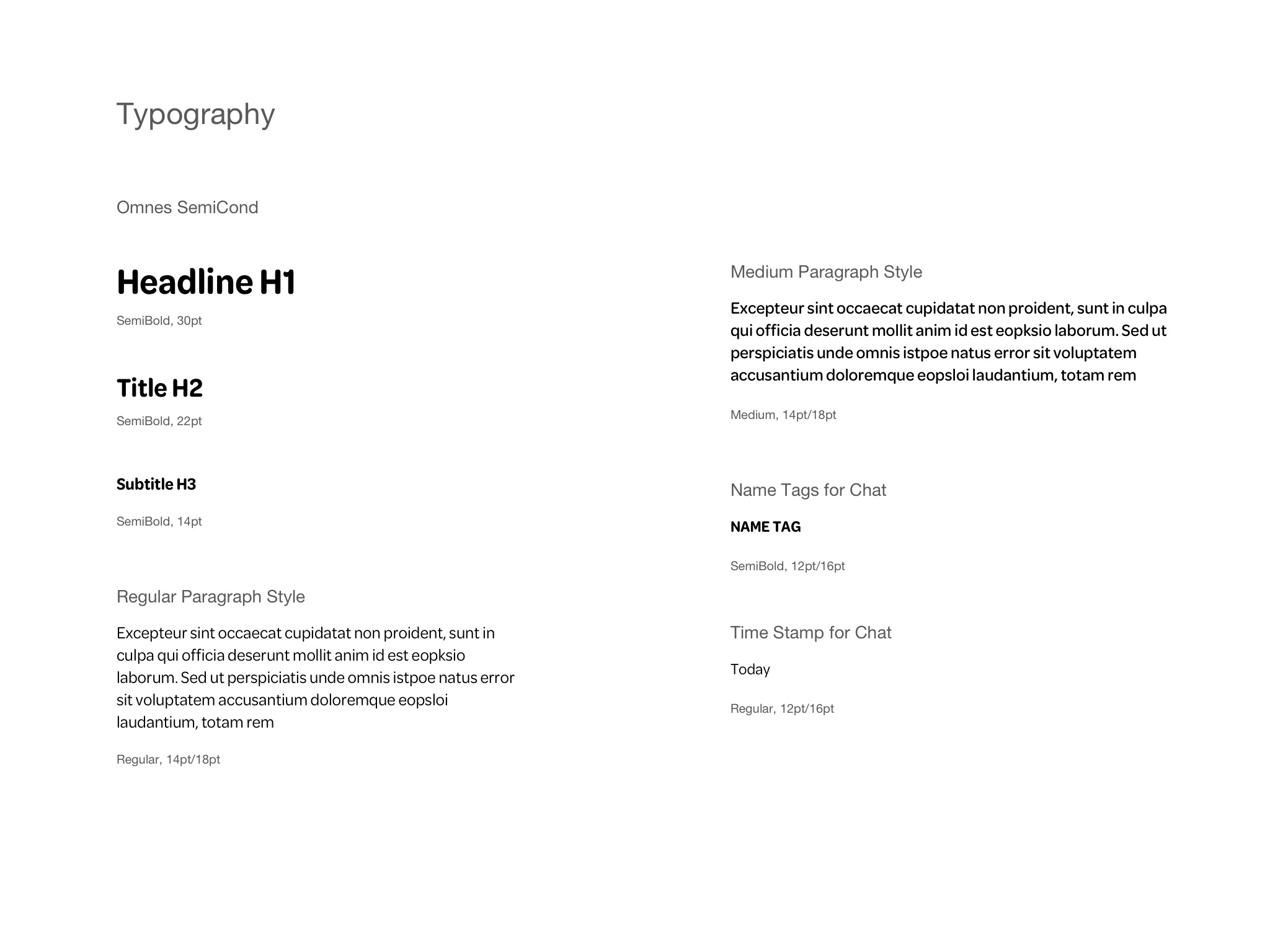
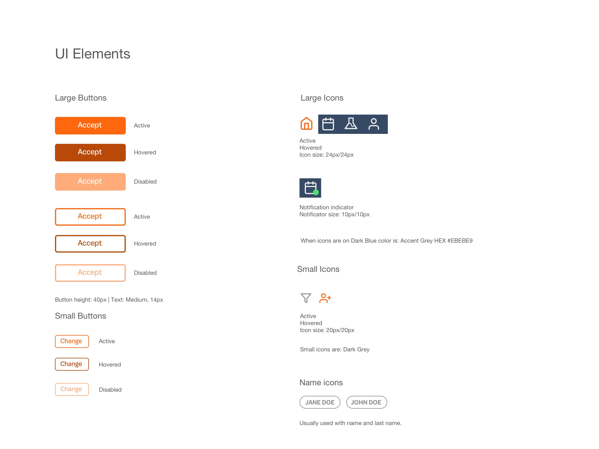
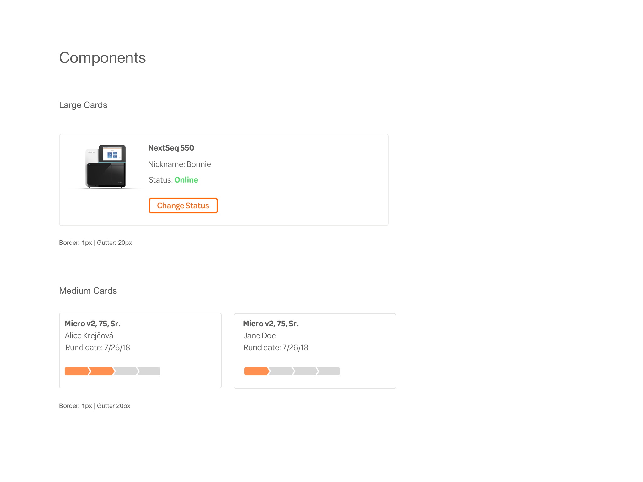
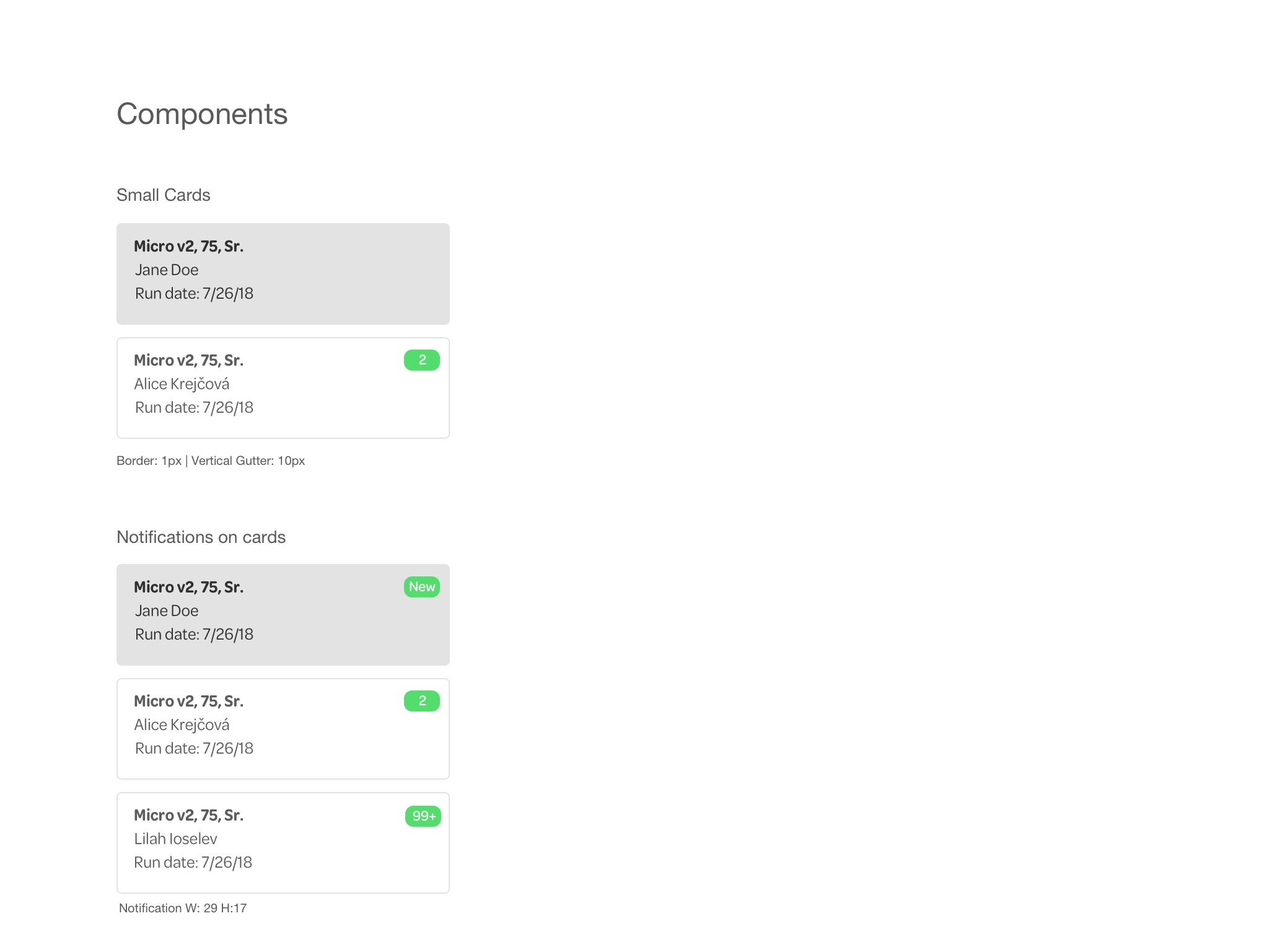
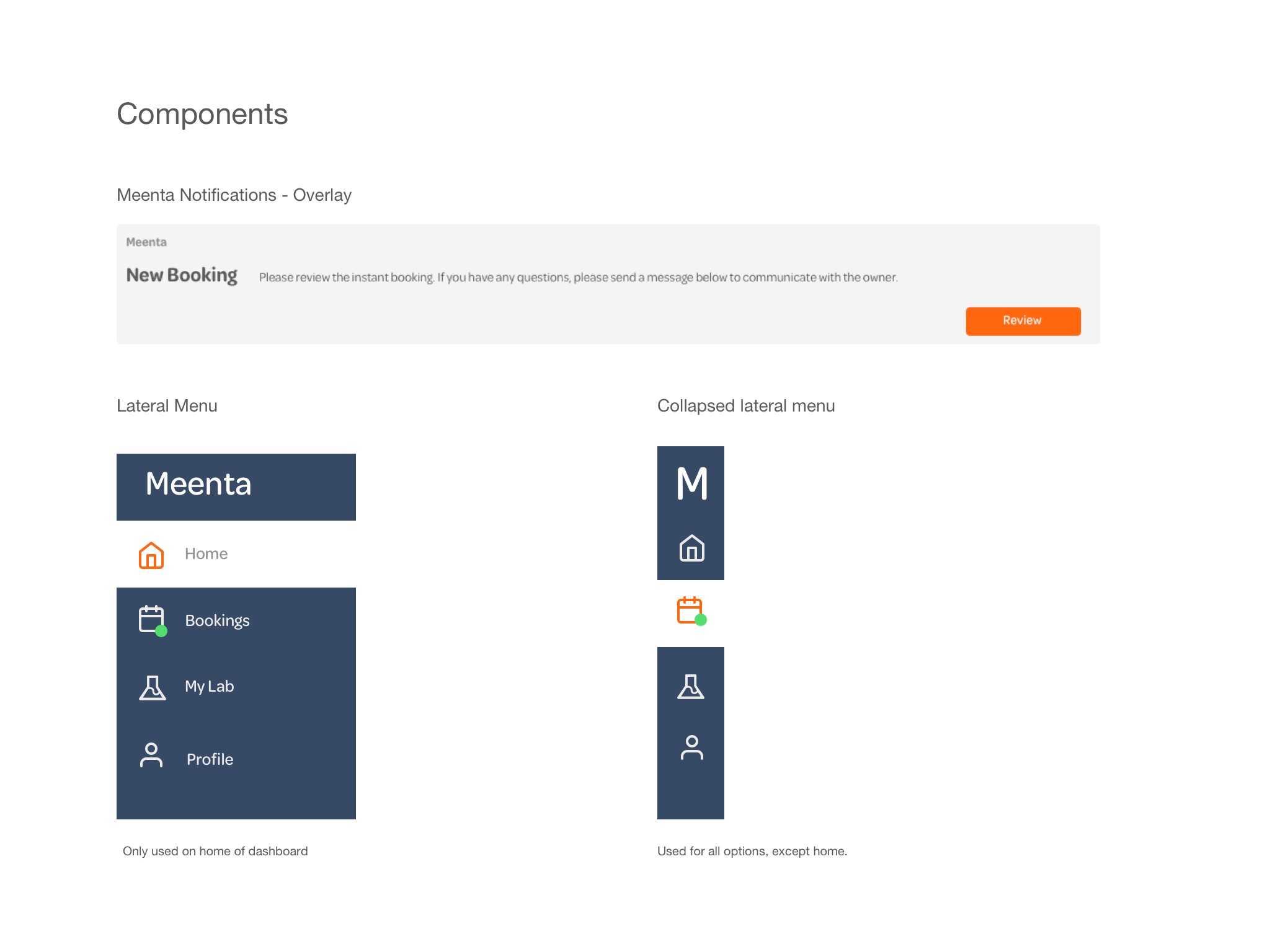
I paid special attention to the grid system, following the same principle of easy upscale. Since my design uses a persistent UI, I used the material responsive layout grid. This grid will make it easy to make the design responsive depending on the device’s size.
Final Design
The design gives the sequencer holders a web app so they can effectively view the status of the samples they are running and communicate with the researchers. The web app also has a cohesive look and feel with a consistent design system. As well as a notification system from Meenta to the sequencer holder clearly identifiable in the UI. If there was more time in the project I would have loved to validate with Meenta’s sequencer holders this design.
Special thanks to Stephan Smith, CTO and Co-founder of Meenta, for his invaluable support on this redesign project.