Research
When I joined the design team the user research was already done. After reviewing the findings, I realized a key audience was missing, the electrical engineers at Vicor also need to be able to use the filtering tool. I decided to do interviews with the electrical engineers working at Vicor. This brought clarity into our design process.
The Discovery
Vicor designs, develops, manufactures and markets modular power converters, power system components and power systems. First, we dissected all the elements of the product filtering. All of their parts can be filtered by their specs: input, output, current or power, and other specific to families of parts, like size or mounting.
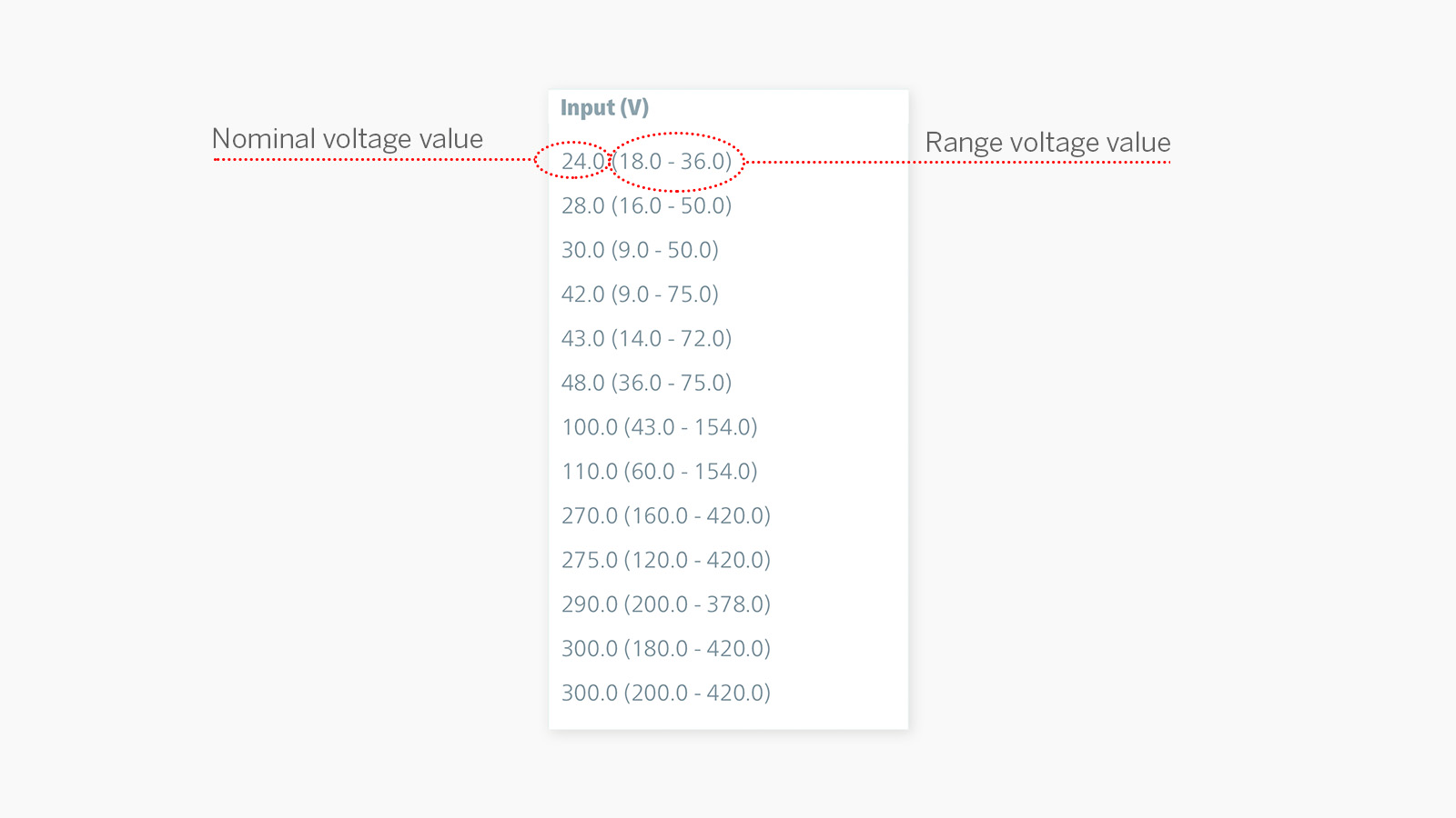
Second, we asked electrical engineers to tell us how they worked with the specs presented to them on screen. For example, input voltage is shown as Nominal (Range) or 24.0 (18.0 – 36.0), we wanted to know which of these three numbers were critical for their product discovery. We found that the range inside the parenthesis is key when using the filtering tool, because it shows clearly the voltage range needed for their electrical designs.
Understanding the User
Insights from our discovery work indicated that there were multiple user groups to cater to with the filtering tool. First, the electrical engineers at Vicor used the filtering to quickly find a product and reach the product page for documentation. Second, the electrical engineers, outside Vicor, came to the website trying to find a product that fit their technical documentation. They were both ultimately looking to find a product but their process to get there was different. The outside engineer needed a way to easily scan the list of specs that would allow them to browse the Vicor products that met their requirements. And, the Vicor engineer needed a way to quickly choose the specs that allowed them to find the product they were looking for.
Design
We designed our first version of the filtering on desktop making sure that both needs were being solved. It had spaces to type in the ranges, a slider, and several other buttons for the rest of the filters. This design failed in two fronts. The first one, the sliders proved to be useless for the filtering since it showed the products inside the range instead of those that were outside of it, which is how engineers read ranges, if you need a range of 2 to 4, you want to see a product that has a range of 1 to 5. And second, once all of these features were brought to the mobile phone the ability to quickly scan the information was lost. So we went back to the drawing board and started designing the mobile experience first.
From Lo-fi Prototype to Wireframe
To ideate quickly, we did some lo-fi -prototypes. After a few iterations, we landed on a version of filtering that relied on an overlay for allowing users to quickly view and select relevant specs. Once opened, the list allows for a quick scan to identify possible matches to the user’s technical documentation or to efficiently find the part and get to the documentation.
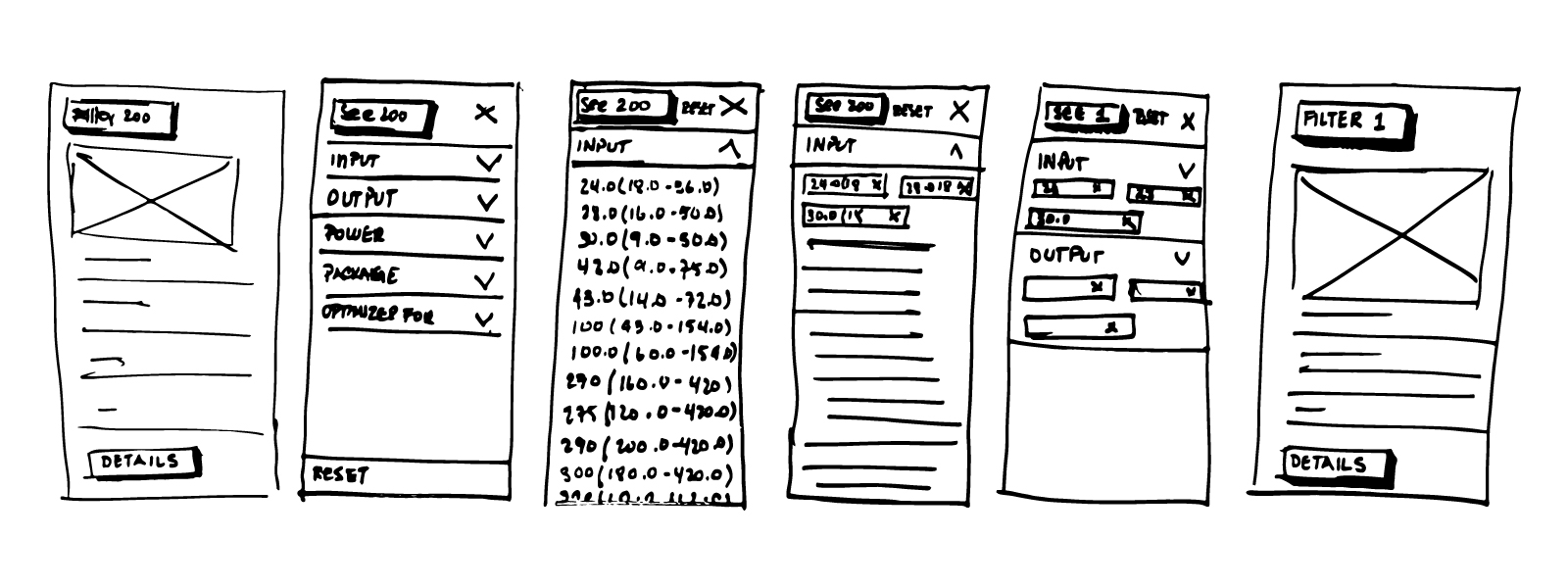
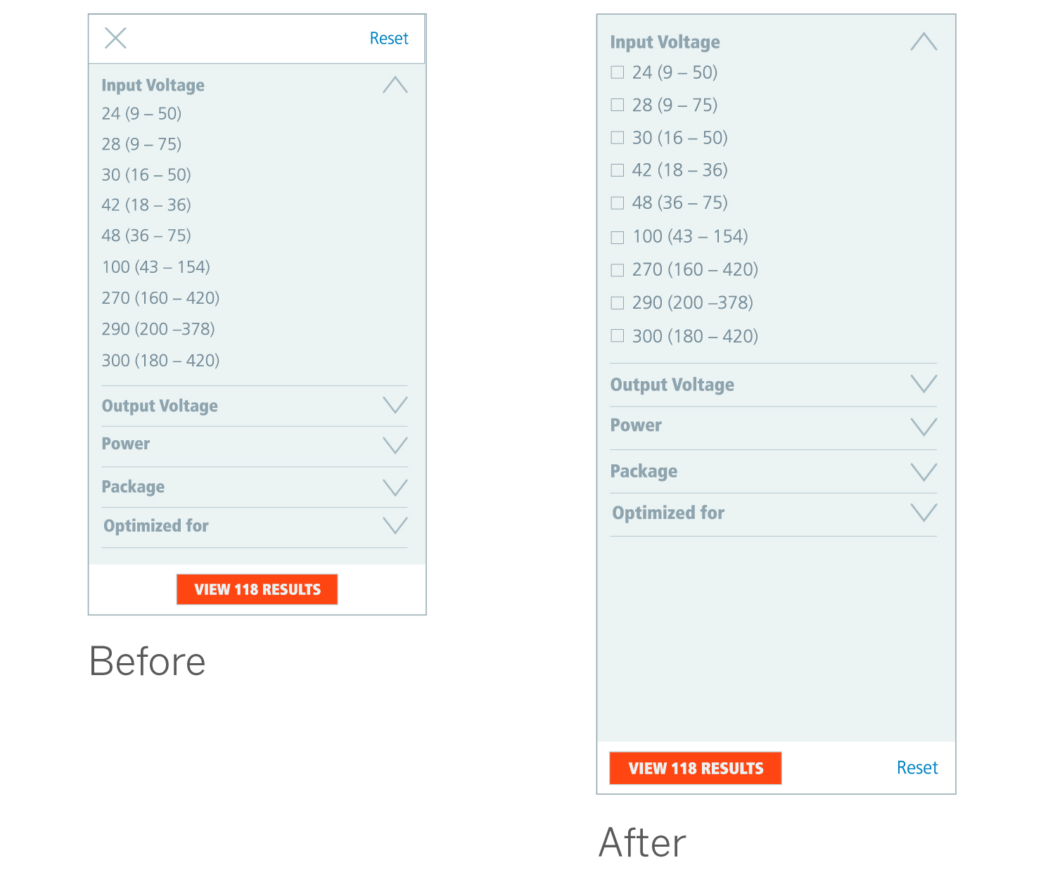
Based on our initial feedback from the mobile lo-fi prototype, I made some changes to the mobile design. I placed the results button at the bottom of the viewport instead of the top for two reasons. First, the user makes selections from top to bottom so it made sense to show the results button on that path. Second, the user’s thumbs would be closer to the lower third of the viewport, where the button is now located.
Using the Design System
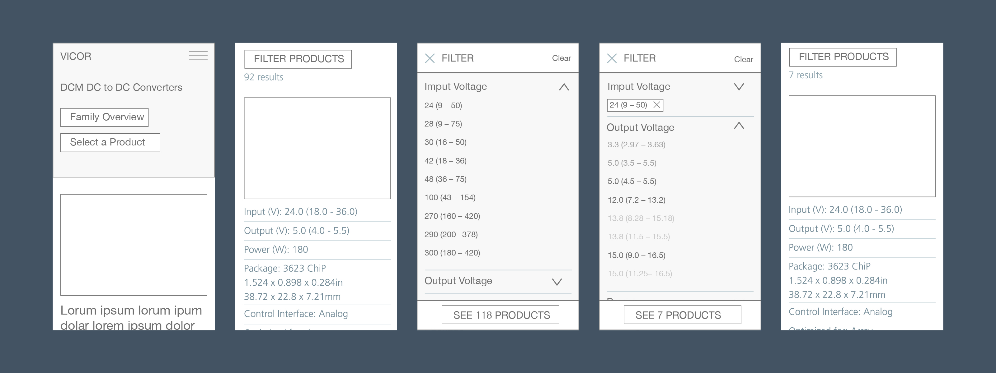
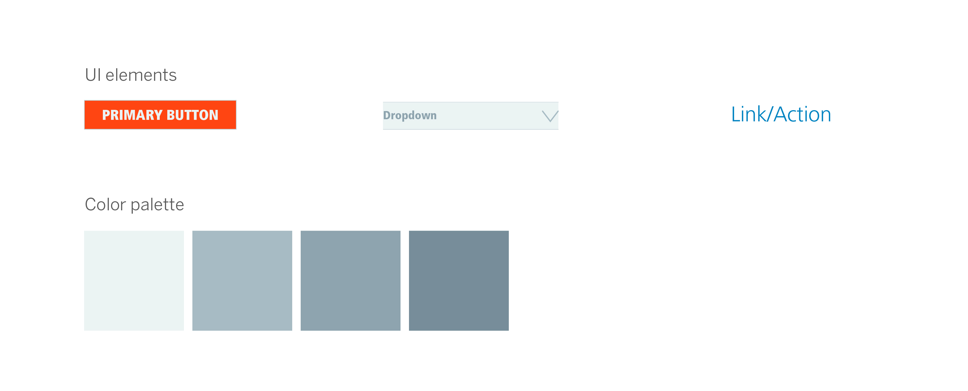
Vicor has a robust design system, designed by the creative director. This allowed us to create high-def prototypes quickly. Which we used for validation with Vicor engineers and sales representatives.
Using the findings from the hi-def prototype validation, I added signifiers to let the user easily understand that more than one spec can be added to the filter. I also removed the top bar and moved the reset button to the lower bar. This allows for a quick reset when the user arrives at the filtering screen.
Final Design
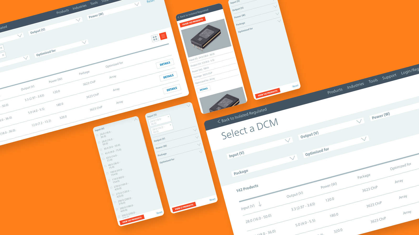
Vicor’s mobile filtering experience is now an intuitive and efficient tool for both inside and outside of Vicor electrical engineers. It displays a list of specs of all available products — a goal of the product & sales department — and permits a top to bottom quick scan for the specs that engineers might be looking for.
The desktop design was kept very simple for users. We continued with the idea to clearly display the chosen specs with tags that can be easily deleted.

