
Research
Vicor designs, develops, manufactures and markets modular power converters, power system components and power systems. Their e-com platform is solely for business to business transactions. For the e-com redesign, we decided on a Lean UX approach that emphasizes sketching, prototyping, user feedback and design mockups. We wanted to provide various opportunities for all stakeholders to have input throughout all the stages of the project. Meeting with the stakeholders periodically allowed us to understand their business goals and to identify risks and expectations.
We decided on a Lean UX approach that emphasizes sketching, prototyping, user feedback and design mockups.
The discovery
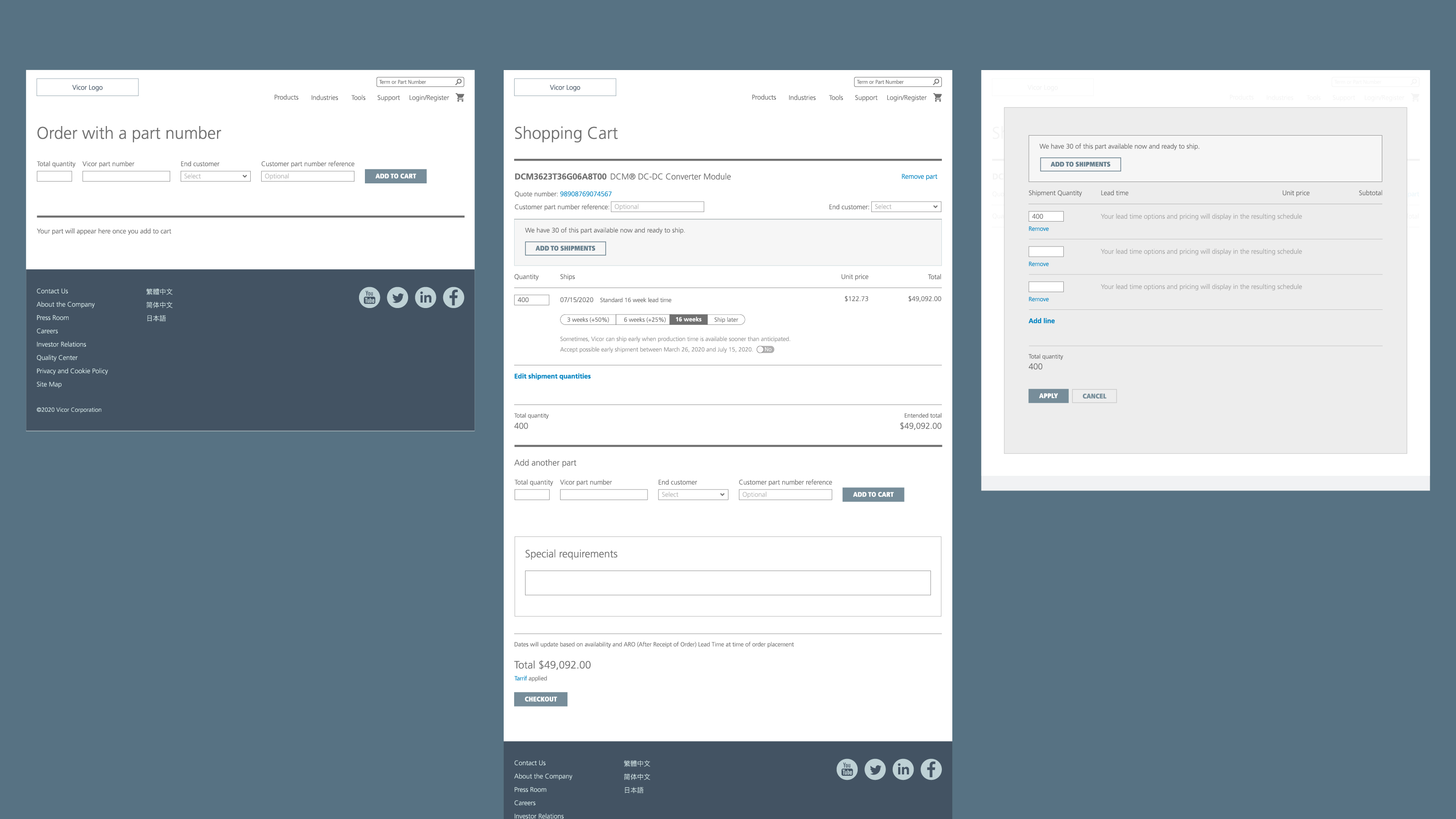
The discovery phase allowed us to identify the project milestones, audit the existing experience, review the competitors, and research the user needs to define their pain points. Our heuristic markup of the cart revealed an information overload and lack of hierarchy. On the screen the user was presented with too many pieces of information like unit price (twice on the screen), description, lead time, total, extended total, customer reference number, among other things. All of these informative elements lacked visual hierarchy that did not permit a clear scan for important pieces of information.
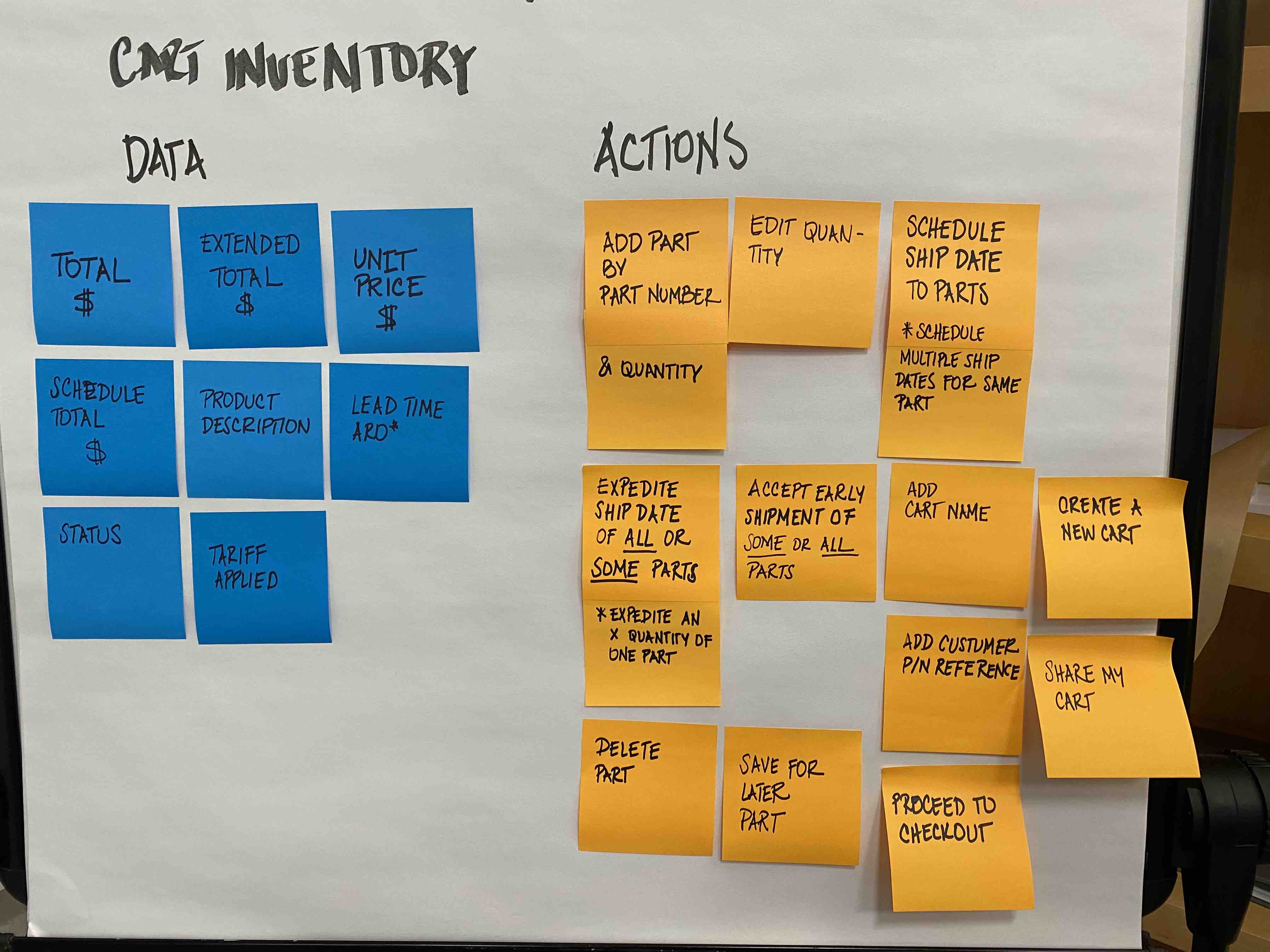
We also discovered how complex the scheduling of shipments is on the platform — complexity that we would confirm later on with our user interviews. To schedule, users can divide an ordered quantity of a part into different shipments. These shipments can be individually expedited, accepted on the lead time or postponed for a later date. When expedited the price per part changes. The scheduling of shipments presents a unique feature that requires a learning curve for the user. The goal was to minimize that learning curve.
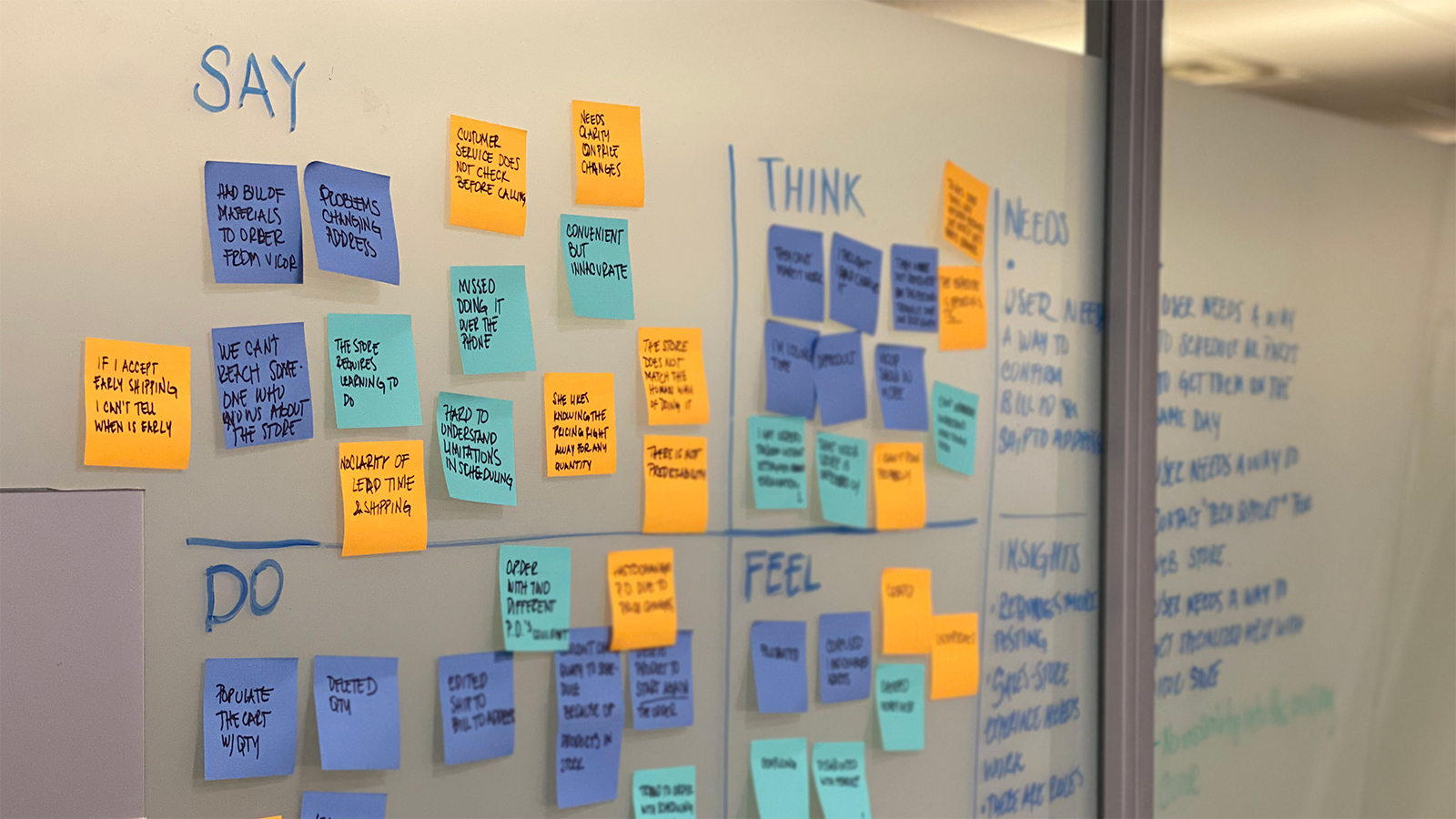
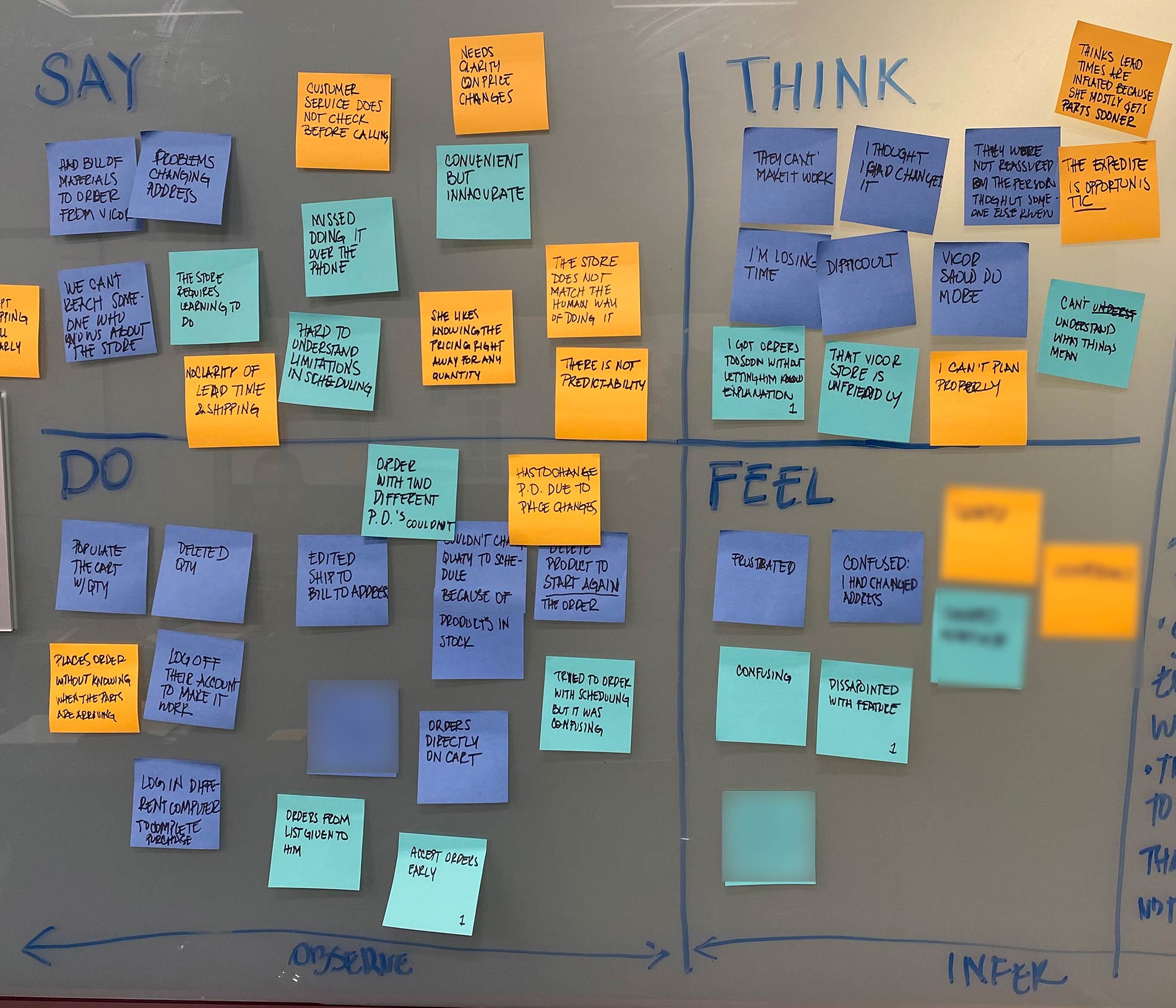
Empathizing with our users
After interviewing our customers we were able to identify three types of personas that we would use throughout the project. These personas were the frequent visitor, the intermittent visitor and the sporadic visitor. We divided them in this way when we identified patterns on our empathy map. When users frequently visited and used the scheduling they seemed to adapt to the interface. But, as their visits fell to five or less during the year they found more inconsistencies with the interface.
Getting everyone involved
We also interviewed other stakeholders within the company that have direct or indirect contact with the shopping cart experience. The customer representatives gave us a big picture about how users walked through the experience and the biggest roadblocks they found. We learned that visitors tend to have issues understanding the information given to them by the shopping cart. This aligned with our finding during our heuristic markup. We also learned that most of the users order parts using the part number instead of going through the site and picking the products.
Design
From our research we understood that our goals were clear. Create information hierarchy, diminish the learning curve, and help the user effectively accomplish their shopping experience. In order to deliver on these goals we created a set of Design Principles to guide us in our process.
INTUITIVE
Helping the user understand and use the design in the context they are in. Empowering them to accomplish their task efficiently.
SCALABLE
Making the design effectively fit multiple screen sizes without sacrificing usability and producing an interface that aligns with the user goals depending on the platform.
LESS-IS-MORE
Reducing operational and cognitive loads of the user by presenting a clear and concise hierarchy of information and actions.
Ideation
In order to understand where the decision making happens during the scheduling, we draw up a simple storyboard that shows the experience of a visitor that would be adding to cart with a part number and will be scheduling shipments. With this in mind and started drawing up different options on how to present the information and minimize the information overload for the user.
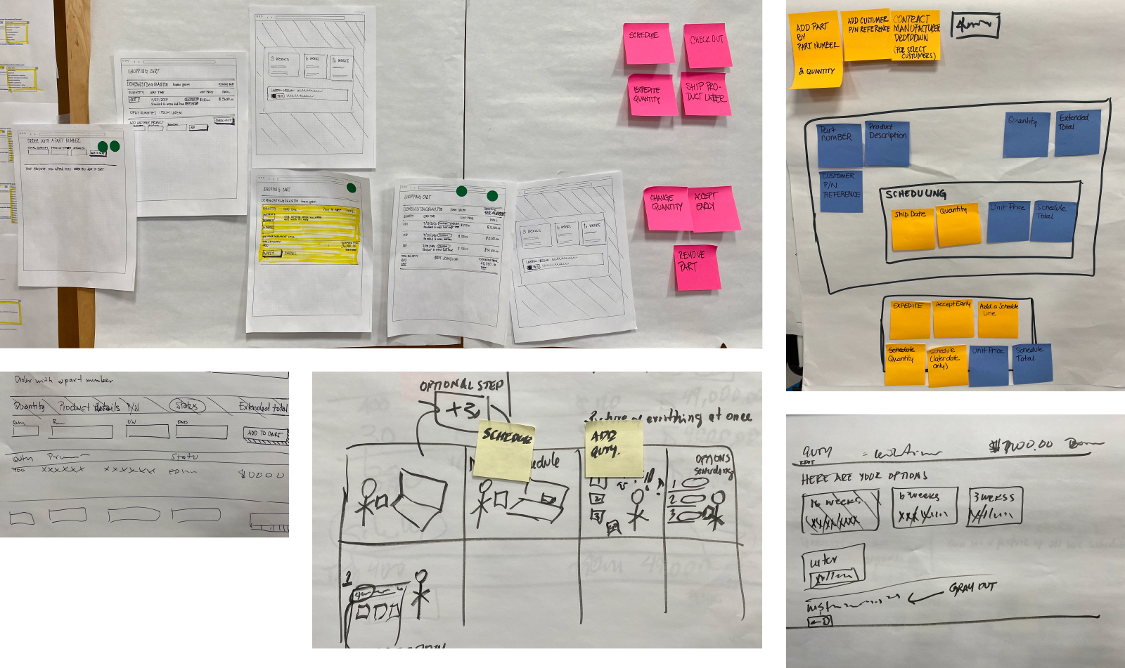
Wireframing and validating
We decided on two directions and validated with a group of people at Vicor. Some did not have direct contact with the store and some indirect. We quickly found that the decision making process about scheduling and expediting shipments happens at the beginning of the user journey. Once users enter their product number they want to know when they are getting the part and the options to expedite, if any. This changed our initial focus of presenting those options on a separate screen and later in the journey.
After this validation process, we decided that presenting all the options available to users was the best way forward. By presenting all the lead time options, visitors are able to choose and decide how to accommodate their shipments depending on their needs.
Hi-def mockups
Our next step is to use the design system to build the hi-def mockups and validate our design with Vicor customers.
Final Design
(I will update this section with the final design after the hi-def mockup validation is done).